Re: HAED The light of the world - 14th February
Posted: Fri Feb 23, 2018 11:17 am
I am going to do something I really don't want to do, but feel I must. I have been biting my tongue for a week and finally need to say it.
I am going to express how disappointed I am in this picture.
I am not the slightest bit disappointed in Vanessa's stitching, it is, as usual, done with skill, speed and precision. Vanessa's skill is awesome. I am sorry to say the result is far from being up to Vanessa's skill level. It is approaching barely adequate. From the wrong side.
The problem, as far as I can see it, is that Vanessa is accurately stitching a chart that was created with nowhere near as much skill or care as Vanessa is stitching it.
I would like to cite several things in evidence. Firstly, the HaED mockup. The mockup is faithful to what Vanessa is stitching. This can be seen here: http://heavenandearthdesigns.com/images ... orld_1.jpg
But, and it is a big 'but', it's not terribly close to the what the painting looks like. No, I'll rephrase that. It's a long way from what the original picture looks like.
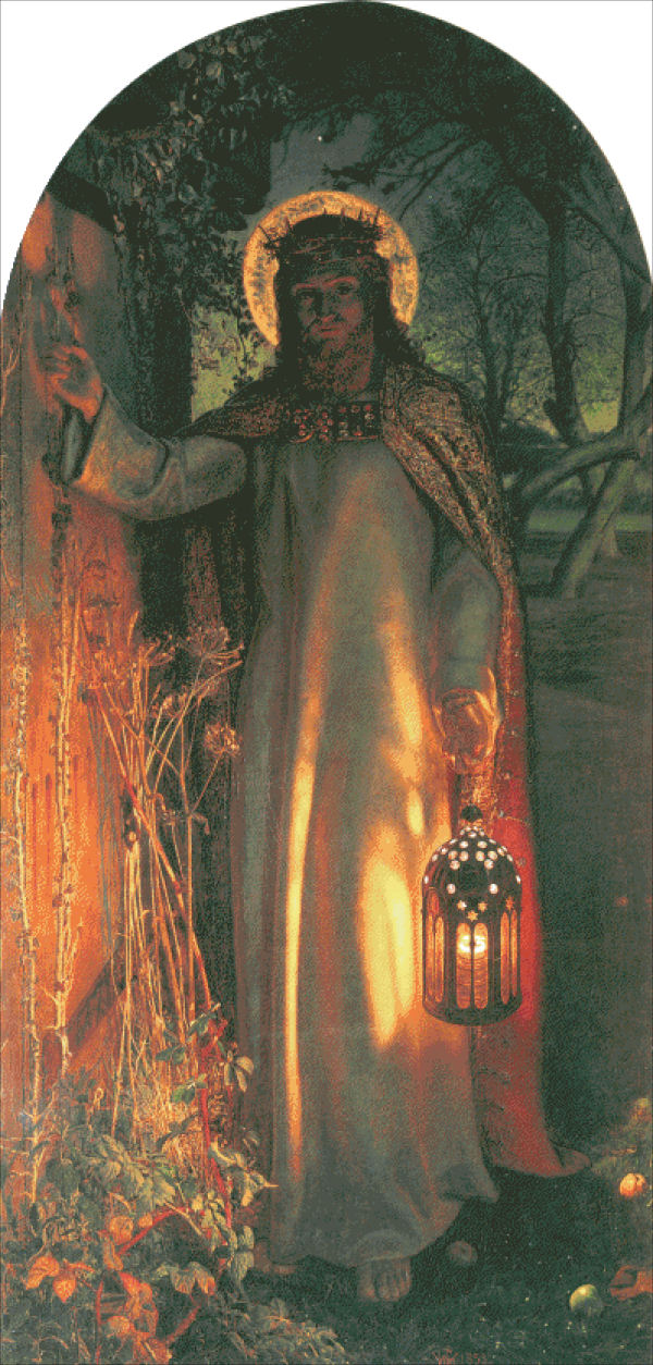
Take a look at the Wikipedia page on the painting https://en.wikipedia.org/wiki/The_Light ... (painting). They have an admittedly grainy image, as shown below (The Wikipedia image is PublicDomain):

Look at the top centre of the image between the trees. Do you see branches or a black blob? The black blob visible in the HaED does not need to be there. Should not be there.
Then, above the figure on the left, in the painting you can see a corbel to the left of the ivy, lit from the underside. Why is there a black blob in the HaED conversion where the corbel should be?
Now, onto the areas where I have most concern about the conversion.
In Vanessa's stitching and the HaED mockup, I cannot see any details in the figure's hair, it's all black with an odd highlight stitch that makes the hair look black with a reflected glow. This changes the picture considerably from the original intention and is poor, very poor.
Then the figure's beard.
Look at the HaED mockup of the beard. It looks like a modern style beard, close trimmed to the chin and possibly, just possibly, a hairy neck also fairly close trimmed to the neck. The other possibility is a double chin. Which is RADICALLY different from the original picture, where the figure has a beard that juts out and projects downwards at least half the neck length. This is a catastrophically bad part of the conversion, it looks so different from the original image you simply can't see what the original artist intended. Also, and this compounds the poor effect, this catastrophically bad bit of conversion is at the focal point of the image, where the maximum conversion precision needs to be. So, the worst bit of conversion is where it needs to be best. This should be unacceptable to HaED and anyone who wants the image.
Now, can I can hear those who want to defend such poor output from HaED and say that 'you cannot get a better conversion within the limitations of an 88 colour conversion'.
I must contradict that and say: You can get a better conversion. And to prove it:
Here is one,

The conversion uses 89 solid DMC colours (which was the closest I could obtain to the 88 from the HaED) and was developed from the Wikipedia image, slightly colour tweaked and softened to get roughly the same tint as the HaED conversion. The colour tweaks took me 30 seconds using PaintShopPro 5.
The image is the chart image output from a charting program at a scale of 1 pixel = 1 stitch and is the size of the HaED finished image. Every pixel is identical to a DMC thread colour and is the same colour as a stitch would be. There is a corbel on the house, there are tree branches in the sky instead of a black blob, the figure's hair looks brown, not black and wow, he has a beard and not a hairy neck or double chin - exactly as the artist painted the picture. This is close to what the HaED conversion should have been like.
The HaED conversion is so bad in the particular areas I have highlighted, if it were me, I'd ask for my money back. I am extremely unimpressed with HaED in the fact they put such a poor conversion up for sale. It shows that the quality of conversion was not a consideration at all when this chart was put up for sale.
I am so disappointed for you Vanessa, your skill deserves so much better from the chart.
Regards,
Richard.
I am going to express how disappointed I am in this picture.
I am not the slightest bit disappointed in Vanessa's stitching, it is, as usual, done with skill, speed and precision. Vanessa's skill is awesome. I am sorry to say the result is far from being up to Vanessa's skill level. It is approaching barely adequate. From the wrong side.
The problem, as far as I can see it, is that Vanessa is accurately stitching a chart that was created with nowhere near as much skill or care as Vanessa is stitching it.
I would like to cite several things in evidence. Firstly, the HaED mockup. The mockup is faithful to what Vanessa is stitching. This can be seen here: http://heavenandearthdesigns.com/images ... orld_1.jpg
But, and it is a big 'but', it's not terribly close to the what the painting looks like. No, I'll rephrase that. It's a long way from what the original picture looks like.
Take a look at the Wikipedia page on the painting https://en.wikipedia.org/wiki/The_Light ... (painting). They have an admittedly grainy image, as shown below (The Wikipedia image is PublicDomain):
Look at the top centre of the image between the trees. Do you see branches or a black blob? The black blob visible in the HaED does not need to be there. Should not be there.
Then, above the figure on the left, in the painting you can see a corbel to the left of the ivy, lit from the underside. Why is there a black blob in the HaED conversion where the corbel should be?
Now, onto the areas where I have most concern about the conversion.
In Vanessa's stitching and the HaED mockup, I cannot see any details in the figure's hair, it's all black with an odd highlight stitch that makes the hair look black with a reflected glow. This changes the picture considerably from the original intention and is poor, very poor.
Then the figure's beard.
Look at the HaED mockup of the beard. It looks like a modern style beard, close trimmed to the chin and possibly, just possibly, a hairy neck also fairly close trimmed to the neck. The other possibility is a double chin. Which is RADICALLY different from the original picture, where the figure has a beard that juts out and projects downwards at least half the neck length. This is a catastrophically bad part of the conversion, it looks so different from the original image you simply can't see what the original artist intended. Also, and this compounds the poor effect, this catastrophically bad bit of conversion is at the focal point of the image, where the maximum conversion precision needs to be. So, the worst bit of conversion is where it needs to be best. This should be unacceptable to HaED and anyone who wants the image.
Now, can I can hear those who want to defend such poor output from HaED and say that 'you cannot get a better conversion within the limitations of an 88 colour conversion'.
I must contradict that and say: You can get a better conversion. And to prove it:
Here is one,
The conversion uses 89 solid DMC colours (which was the closest I could obtain to the 88 from the HaED) and was developed from the Wikipedia image, slightly colour tweaked and softened to get roughly the same tint as the HaED conversion. The colour tweaks took me 30 seconds using PaintShopPro 5.
The image is the chart image output from a charting program at a scale of 1 pixel = 1 stitch and is the size of the HaED finished image. Every pixel is identical to a DMC thread colour and is the same colour as a stitch would be. There is a corbel on the house, there are tree branches in the sky instead of a black blob, the figure's hair looks brown, not black and wow, he has a beard and not a hairy neck or double chin - exactly as the artist painted the picture. This is close to what the HaED conversion should have been like.
The HaED conversion is so bad in the particular areas I have highlighted, if it were me, I'd ask for my money back. I am extremely unimpressed with HaED in the fact they put such a poor conversion up for sale. It shows that the quality of conversion was not a consideration at all when this chart was put up for sale.
I am so disappointed for you Vanessa, your skill deserves so much better from the chart.
Regards,
Richard.


