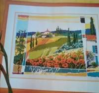
Thank you all for your encouragement!

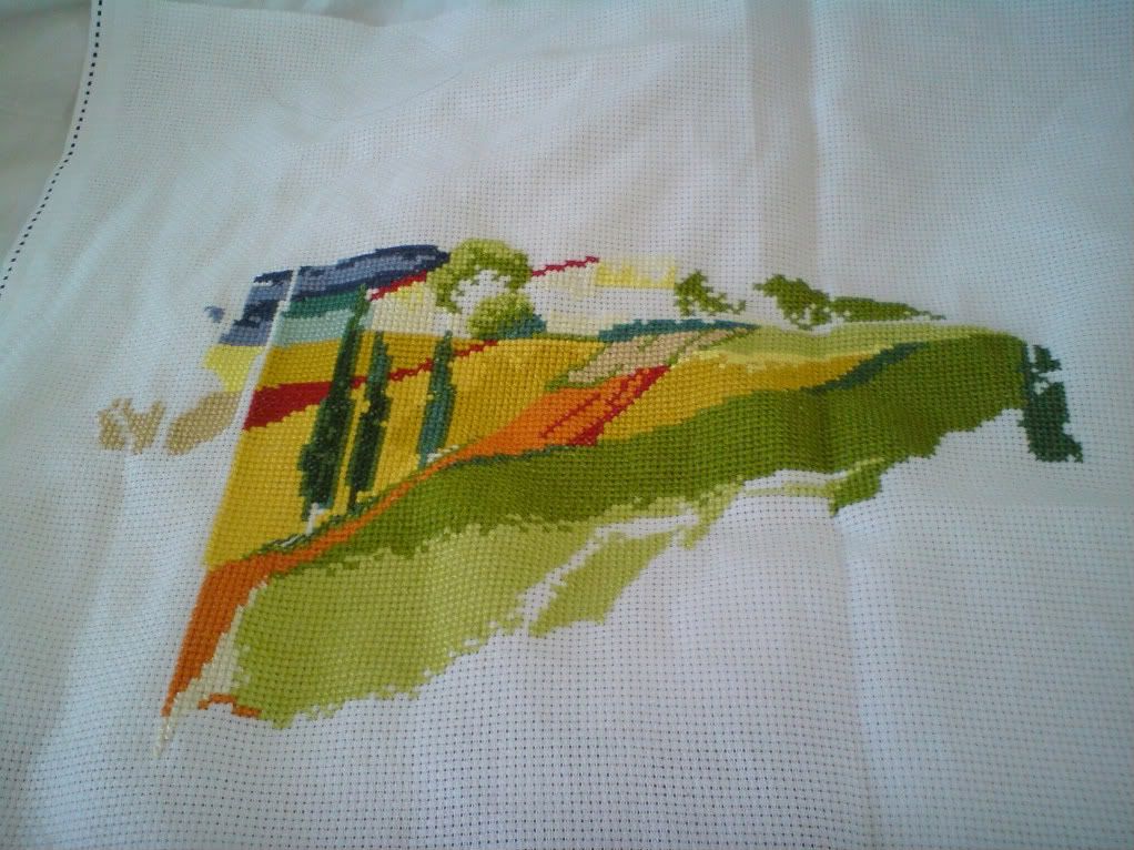
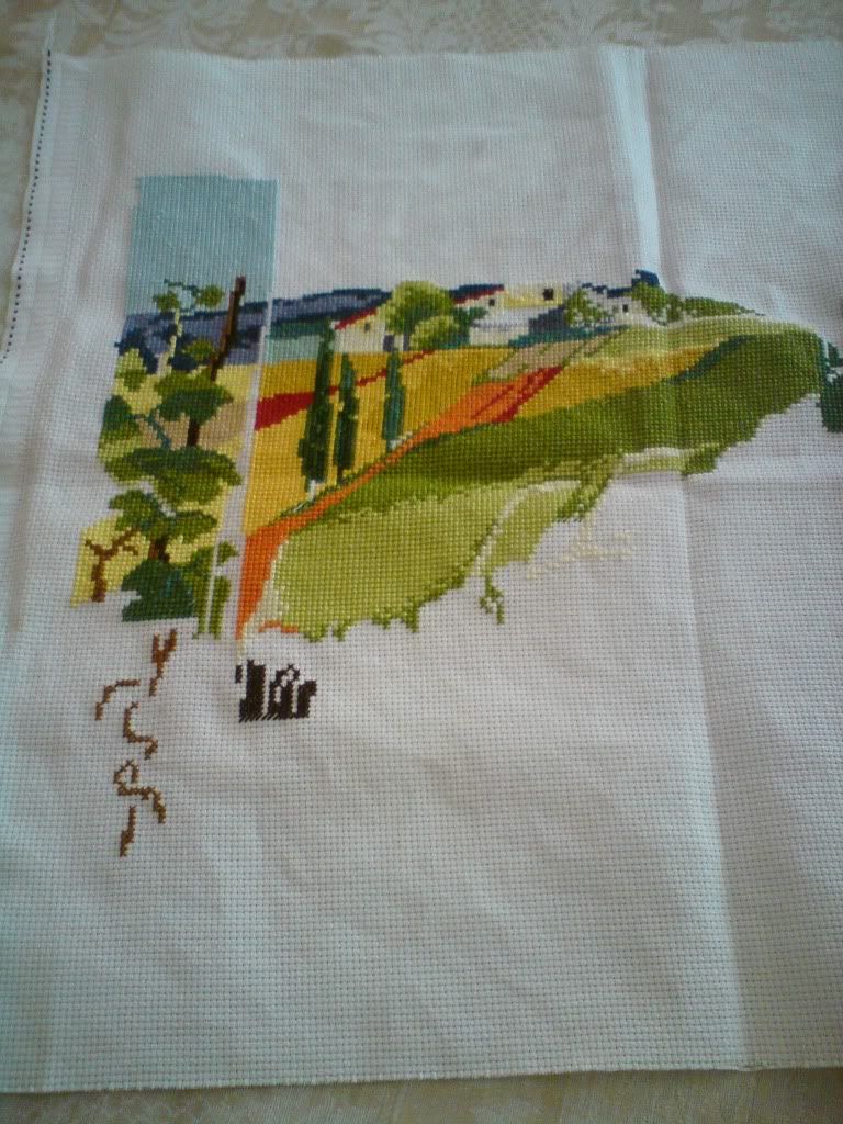
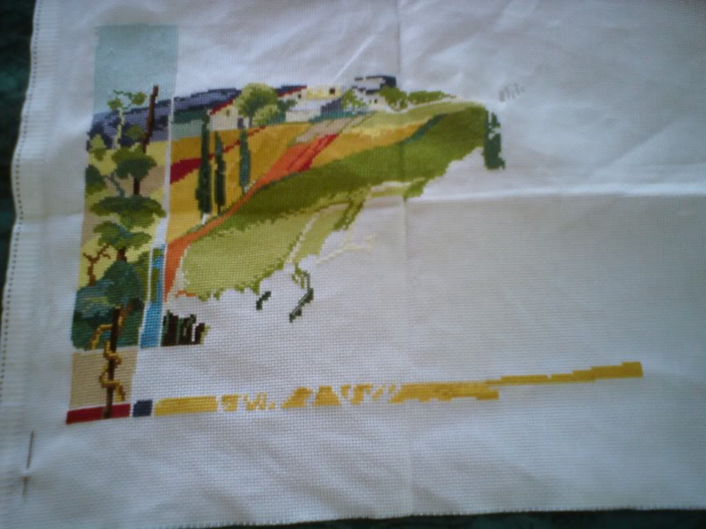
The chart is not very friendly (though there probably are worse) because:
1. it's only black-and-white - that's not so much of a problem,
2. it uses both symbols and numbers for each color, so that the larger areas are coded with numbers. This is very inconvenient, because for each color area which is larger than, say, 3X3 but irregular, they combine numbers and symbols,
3. and finally - the key is wrong! They show symbols which are not even on the chart, and some of the chart symbols are not on the key

. I had to do some detective work to match symbols and colors...
Even so, I like the picture so much, I guess it's worth it